.Rapro Logotype
.The Rapro Logotype owns a modern and professional design. Considering the sector where Rapro specializes, a sharp writing character was used. Also, the definition of ‘’AUTOMOTIVE RUBBER PARTS’’ in the logotype has been used in English because of the brand’s trade activities in the international aspect. This structure is constant and cannot be modified.
.Propositions
.Rapro Logotype is designed according to the certain ratios and measurements and no modifications should be made on them. All ratios are based on the thickness of the ‘’R’’ lines. A balanced emblem has been created with these rates spreading all over the logotype. The ratios stated on the page as follows:
- .Typeface ratio X
- .Logo and space rates 11x
- .Oval lines and rates.
.Safety Area
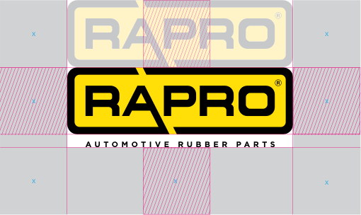
.In the fields where the Rapro Logotype is used, an area (security area) has to be left blank so that it is not adversely affected by external factors and no harm will be caused to the integrity of the corporaion. This area is too long for Rapro writing and should not be altered in any way.
.Minimum Size
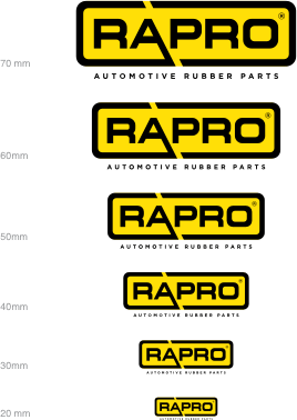
.As the areas of use the Rapro Logotype decreases, the logotype also needs to be smaller. The minimum usage is set to 20 mm so that the Rapro logotype is not difficult to read and perceive.
.Color
.The Rapro Logotype consists of two colors, yellow and black. These colors represent Rapro’s innovative structure; while visually distinguish the brand from its competitors in the industry. The colors of Rapro are selected from Pantone Solid Coated catalogue and suitable for all printing and application techniques.
C 0 M 9 Y 100 K 0
R 255 G 223 B 0
.Logotype Usage For Different Background - 1
.When the Rapro Logotype is used on different grounds, colors should be chosen in order to not make it difficult to read and perceive. Corporately determined ground colors are like those on the page as follows.






.Logotype Usage For Different Background - 2
.When the Rapro Logotype is used on different grounds, colors should be chosen in order to not make it difficult to read and perceive. Corporately determined ground colors are like those on the page as follows.








.Icon Usage For Different Background
.Icon Usage For Different Background
